
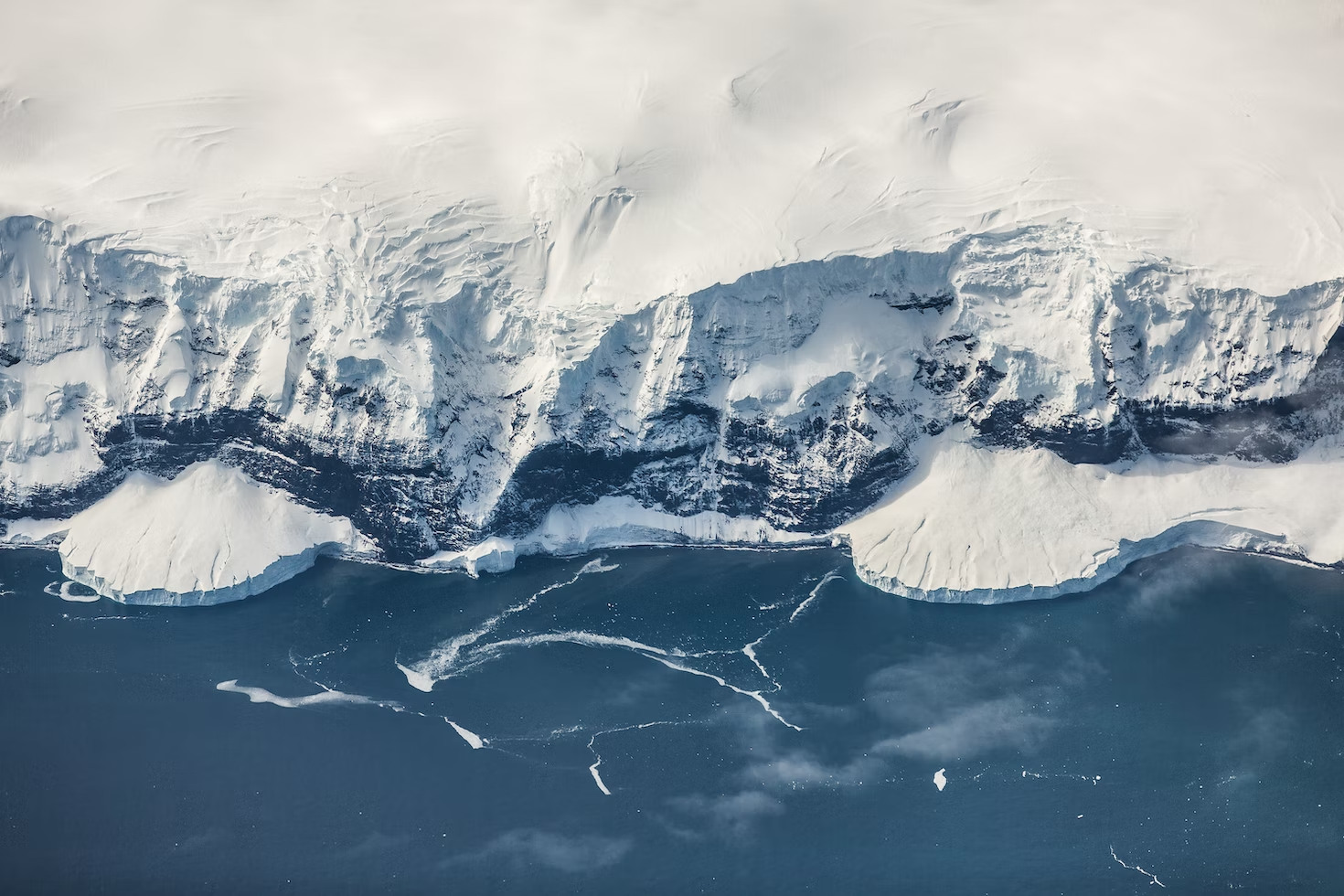
Antarctic Ice Mass Loss 2002-2020
Provided by: NASA|Published on: April 27, 2021|Last updated: July 16, 2026
Grades: 6, 7, 8, 9, 10, 11, 12
Type: Videos
Subjects: Earth and Space Sciences
Authors: NASA
Location: Polar Regions

This resource has been reviewed by SubjectToClimate's climate scientists and verified for scientific accuracy and up-to-date information. Learn about our review process →
This resource has been reviewed by SubjectToClimate's climate scientists and verified for scientific accuracy and up-to-date information. Learn about our review process →
Synopsis
- In this short animation from NASA, students observe an animated graph and color-coded map of Antarctica that show Antarctica's ice loss over the last 20 years.
Teaching Materials
Positives
- Students can look at the graph and follow along with it, making it useful to visualize the tons of ice loss per year.
Prerequisites
- Students need to be familiar with climate change and how it is causing ice melt in Antarctica.
Differentiation & Implementation
- This video has no sound and is short, so the teacher can repeat it, pause it, or play it slower to allow students to watch the changes as they unfold.
- Students can answer questions about the causes of ice melt in Antarctica or connect it to the concept of albedo.
- Teachers can ask students to write explanatory texts based on the data presented in the graph to describe what is happening.
This resource visualizes the loss in ice mass of the Antarctic Ice Sheet since 2002 as a result of anthropogenic climate change. This resource is recommended for teaching.
Teaching Tips
Standards
Resource Type and Format
Scientist Reviewed
This resource has been reviewed by SubjectToClimate's climate scientists and verified for scientific accuracy and up-to-date information. Our review process ensures that every resource in our library reflects the current state of climate science.
Learn about our review process →